BOX'D EATS
BRAND AND SITE
CLIENT
BOX'D EATS
YEAR
2021
SERVICES
NEW LOGO
BRAND IDENTITY
WEBSITE
E-COMMERCE
GET BOX'D!
Most brands are built around a target persona, but when kids are involved, you need something that parents will want to buy but kids will want to use again. Fortunately, healthy easy meals that appeal to parents and kids appealed to us and were able to have a lot of fun with it.
Playful
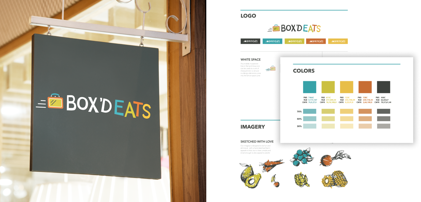
We created a clean, easy to read, easy to recognize, icon and font that looks like it could have been handwritten. If someone had great handwriting.

Colorful
Keeping the font minimal helped to create a timeless look for the brand
Quirky
We used mix colors and a simple lunch box to make it fun and retro at the same time.
Playful
We created a clean, easy to read, easy to recognize, icon and font that looks like it could have been handwritten. If someone had great handwriting.
Quirky
Modern logos are often simple and minimalistic which is exactly what we wanted to achieve with this typeface
Colorful
Keeping the font minimal helped to create a timeless look for the brand

BOX’D EATS IDENTITY
We created a brand identity that had a distinctive retro and fun feel to it. Illustrated, but not cartoony. Something that appeals to parents who are going to buy and the kids who are going to use it. The illustrated brand style can apply to any graphic, ingredient and all the content has the same fun tone to it. Its immediately recognizable even without the logo.

AN IMMERSIVE WEBSITE EXPERIENCE
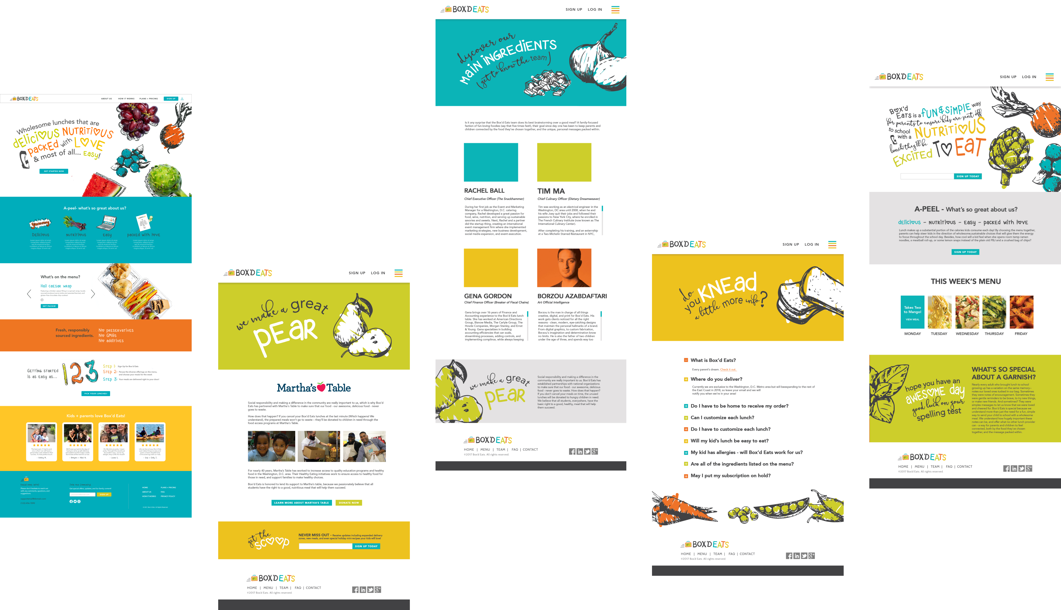
When creating the site, we made sure to keep the strong brand identity front and center. This makes the user-experience more stimulating and engrossing as one scrolls through each page.
BRAND PATTERNS
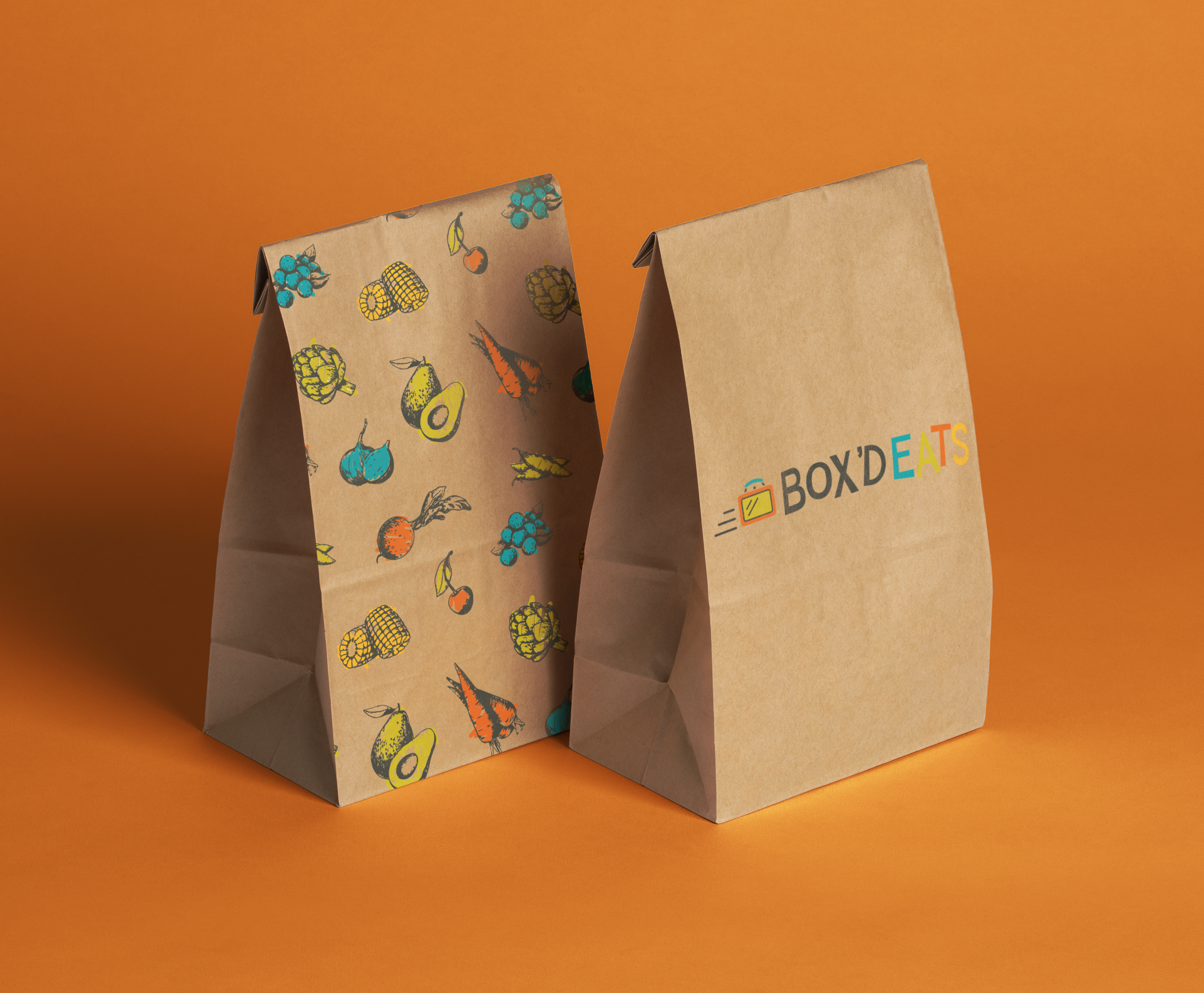
We created quite a few excited brand patterns with the hand illustrated ingredients of the meals. Virtually unlimited applications and options as the ingredients change.

.png)

.png)