ARTHUR BROOKS
BRAND AND SITE
CLIENT
ARTHUR BROOKS
YEAR
2022
SERVICES
NEW LOGO
BRAND IDENTITY
WEB DESIGN
WEB DEVELOPMENT
LIVE BETTER BE HAPPIER
Arthur Brooks aims to lift people up and bring them together in the spirit of happiness. This is a huge part of Arthur’s mission that we wanted to capture in the logo and throughout his website.
CREATING A UNIQUE LOGOMARK
Arthur was looking for a logo that communicates happiness, intelligence, and new ideas. This logo encapsulates all three with a light bulb symbolizing idea-making and a smiling brain for an approachable and unique symbol for the brand.
BRAIN
Happiness is linked to the left hemisphere of the brain
LIGHT BULB
Symbolizing insight, knowledge, and thought
SMILE
Represents Arthur’s goal to pursue happiness within our reach
.png)
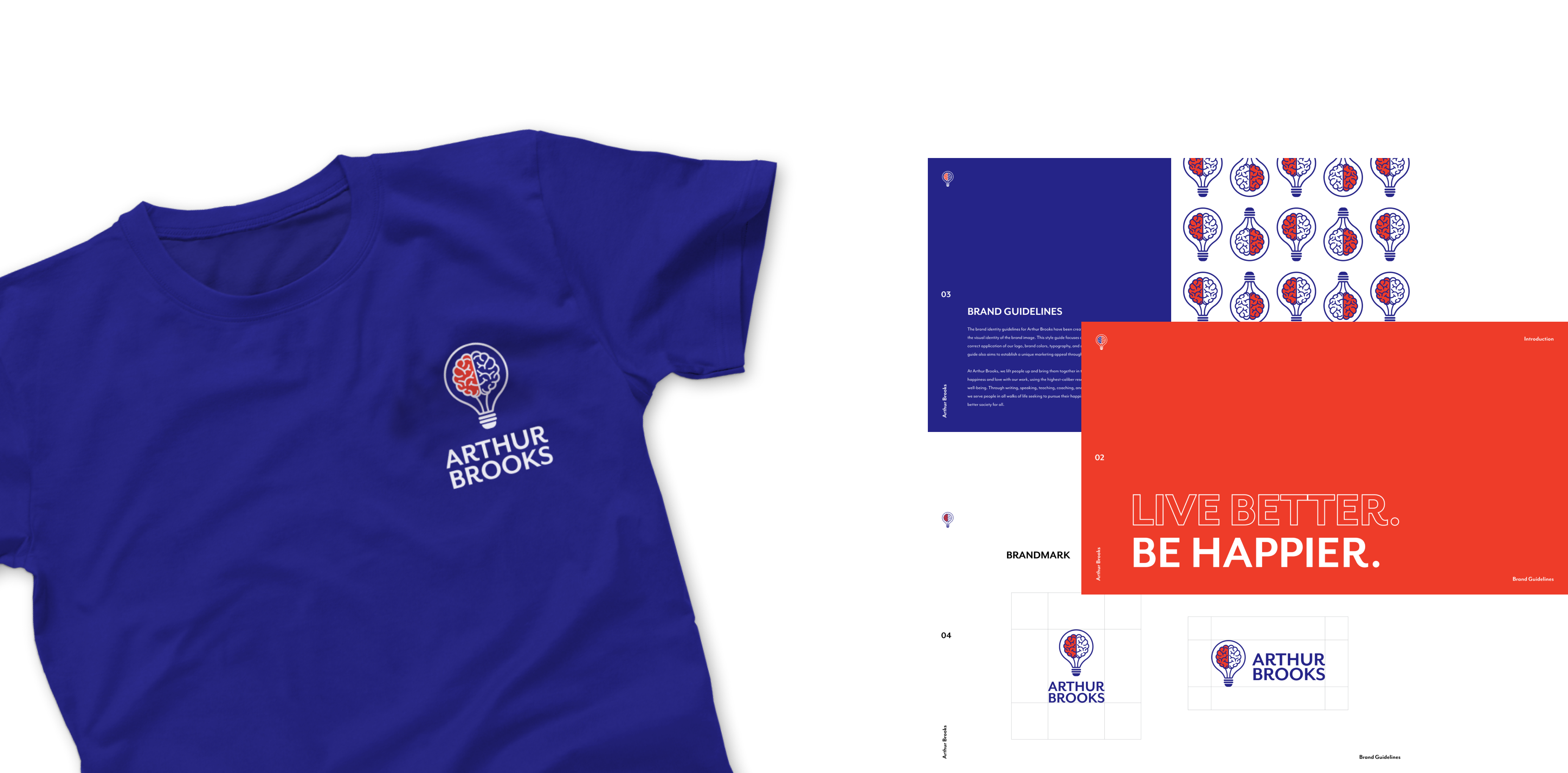
ARTHUR BROOKS IDENTITY
After creating the logo, we went through a few iterations of color choices, coming to a selection of a bright blue and red color palette. We used the brain imagery in the logo to create a squiggle pattern for a fun and unique addition to the brand
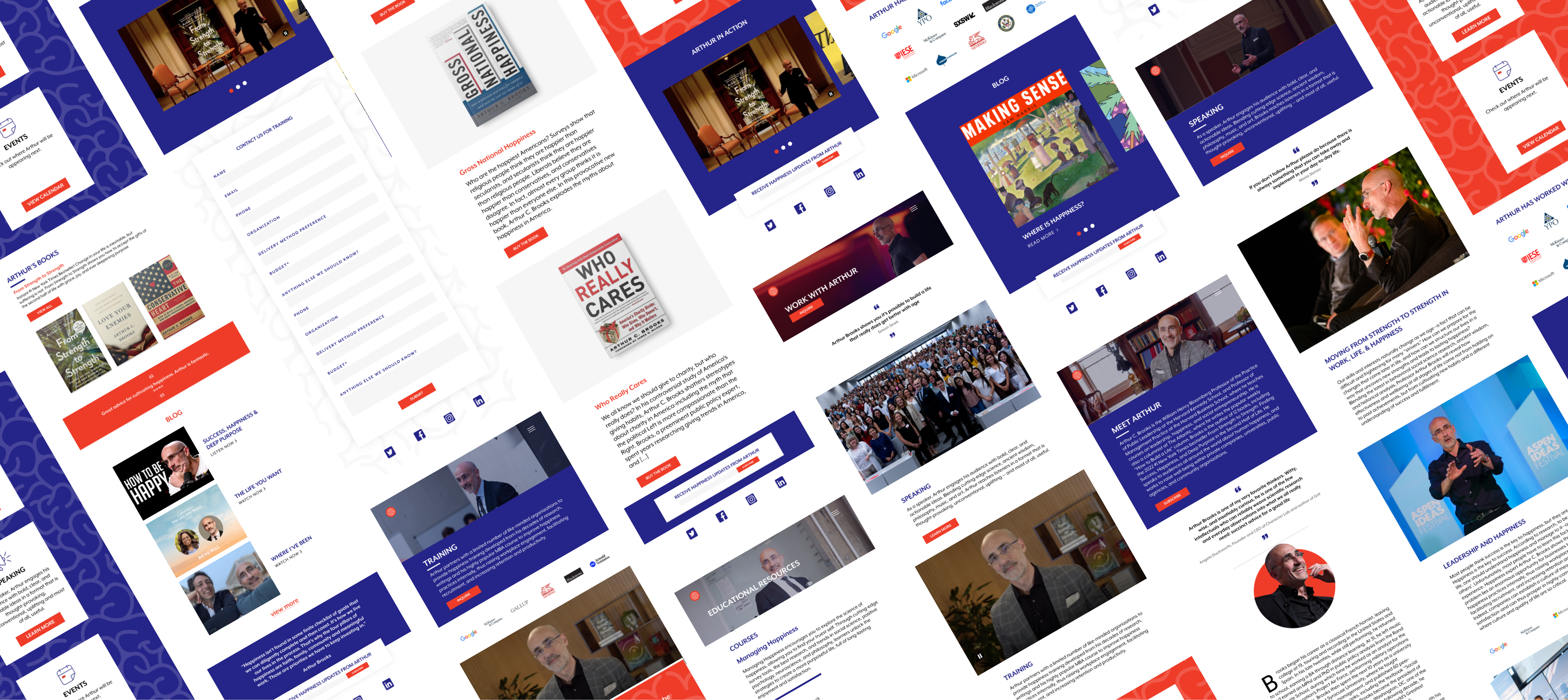
AN IMMERSIVE WEBSITE EXPERIENCE
The websites purpose was to give users a background of Arthur Brooks, see his past events and what has led him to be who he is today. It’s also useful to work with Arthur. We built a site that accomplishes providing users with all this information as well as directing them the right way to get in touch.

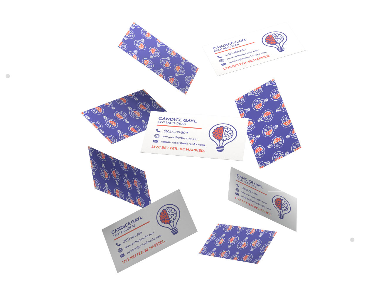
COLLATERAL
After creating the logo, our team designed patterns that could be used throughout web and print materials. The repeated brain icon symbolizes the left hemisphere of a brain being lit up by happiness.

BRAND PATTERNS
We created a few brand patterned to be used in collateral. This repeated icon pattern symbolizes the left hemisphere of a brain being lit up by happiness.

DESIGN
With branding projects, we want cohesive design through all marketing materials. This includes colors, fonts, and patterns. All of which are selected to make the brand recognizable.
BRAND PATTERNS
We created a few brand patterned to be used in collateral. This repeated icon pattern symbolizes the left hemisphere of a brain being lit up by happiness.

DESIGN
With branding projects, we want cohesive design through all marketing materials. This includes colors, fonts, and patterns. All of which are selected to make the brand recognizable.