CADRE
BRAND IDENTITY
CLIENT
CADRE
YEAR
2022
SERVICES
NEW LOGO
BRAND IDENTITY
COPYWRITING
WEB DESIGN
A TIMELESS BRAND
CADRE was a unique branding project we took on for an exclusive, invitation-only community focused on business networking. The idea was to create a logo and brand identity that stood out from competitors and had a unique brand story.
A TIMELESS BRAND IDENTITY
This logo mark was a collaborative effort from the entire NickelBronx team and our client. We worked together to create something that would be timeless, memorable, and unique. The logo ended up taking on a retro look that inspired the rest of our branding elements as you’ll see below.
THE 3 CS
content
community
collaboration
PILL SHAPE
The shape of this logo represents taking a dose of medicine

RETRO COLOR
We chose a timeless and adaptable color palette for this logo
A TIMELESS BRAND IDENTITY
This logo mark was a collaborative effort from the entire NickelBronx team and our client. We worked together to create something that would be timeless, memorable, and unique. The logo ended up taking on a retro look that inspired the rest of our branding elements as you’ll see below.
THE 3 CS
content
community
collaboration
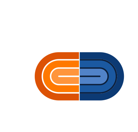
PILL SHAPE
The shape of this logo represents taking a dose of medicine
RETRO COLOR
We chose a timeless and adaptable color palette for this logo
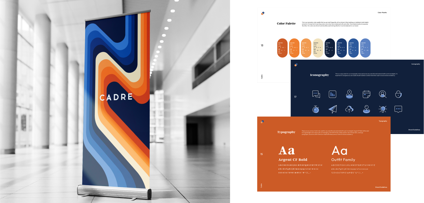
CADRE’S IDENTITY
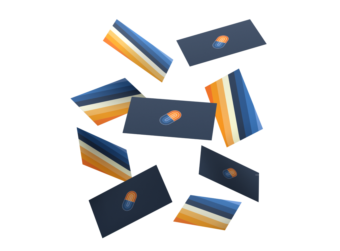
We created a brand identity that had a distinctive retro characteristic to it. This allowed for a lot of creativity when it came to mapping out Cadre’s brand identity. We stuck with soft lines, wavy patterns and lots of color. Our client was keen on sticking with a blue and orange color scheme, so we expanded the color palette keeping this in mind. We felt this expansion gave more flexibility for the brand.
AN IMMERSIVE WEBSITE EXPERIENCE
When creating the site, we made sure to keep the strong brand identity front and center. This makes the user-experience more stimulating and engrossing as one scrolls through each page.
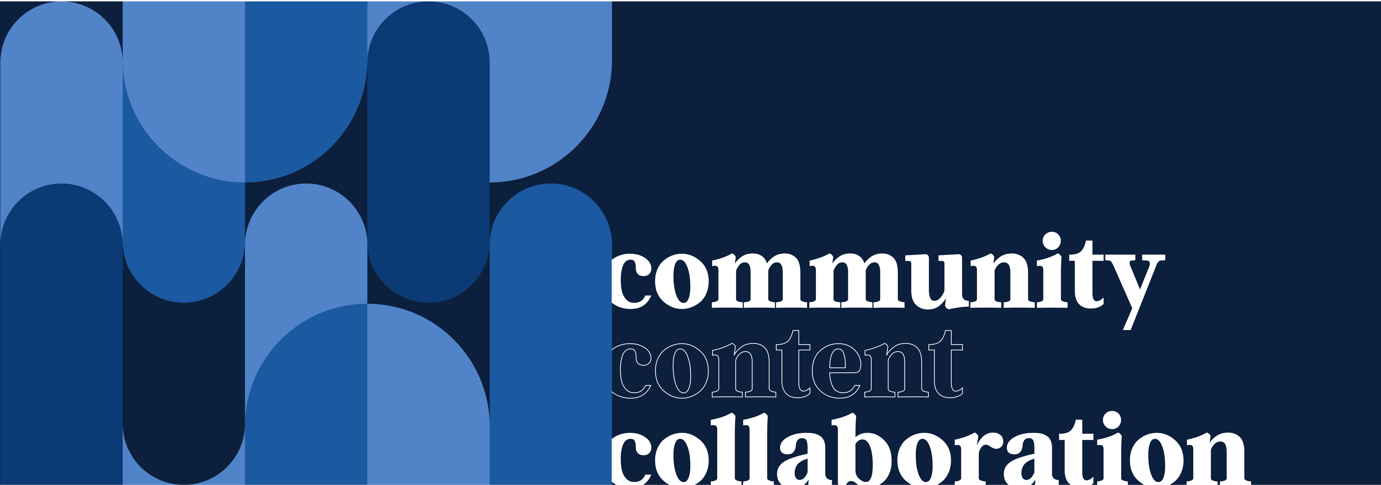
BRAND PATTERNS
We created quite a few excited brand patterns to use with marketing collateral so it could be fun, exciting, and fresh. There is so much more room to grow when the brand has lots of wiggle room but still maintains a clear look and feel.
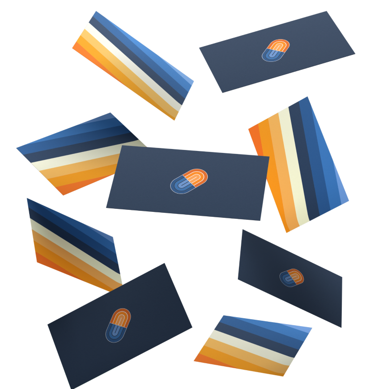
CLEAR SPACE
Although there is a lot to work with when it comes to the brands full scheme of colors, fonts, and patterns, we want there to be a lot of negative space when the logo is in use, so it stands out and is clearly identifiable.
BRAND PATTERNS
We created quite a few excited brand patterns to use with marketing collateral so it could be fun, exciting, and fresh. There is so much more room to grow when the brand has lots of wiggle room but still maintains a clear look and feel.
CLEAR SPACE
Although there is a lot to work with when it comes to the brands full scheme of colors, fonts, and patterns, we want there to be a lot of negative space when the logo is in use, so it stands out and is clearly identifiable.