CAFE LEVANTINE
BRAND IDENTITY
CLIENT
CAFE
LEVANTINE
YEAR
2022
SERVICES
NEW LOGO
BRAND IDENTITY
JUST LIKE MAMA MADE IT
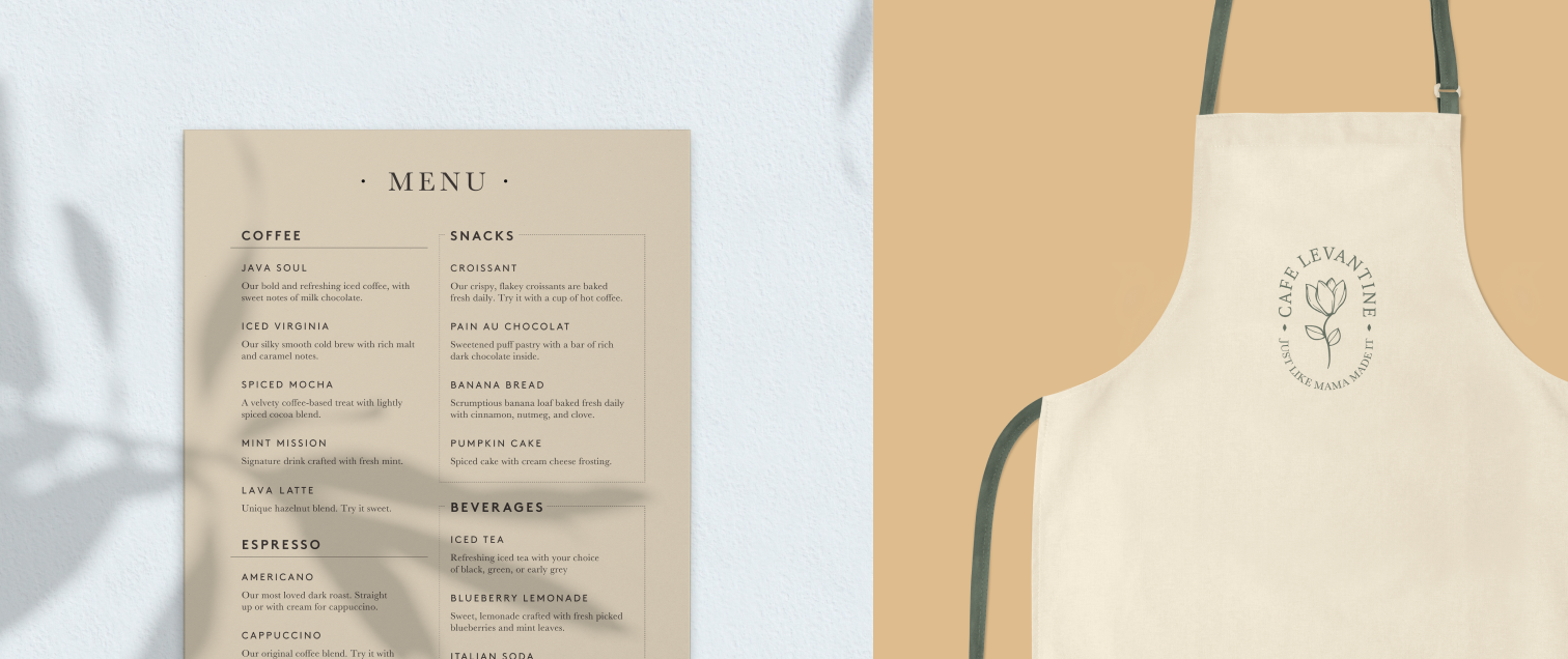
Cafe Levantine’s unique positioning as a home-like cafe shop is to create a coffee experience just like that of home. They wanted a brand that people could connect to and feel comforted by. The logo we created translated perfectly into their brand story.
A HOUSEHOLD BRAND NAME
We wanted the logo of Cafe Levantine to be delicate, simple, and classic. The Cyclamen flower in the center is native to Lebanon, the hometown of the founder. This created an emotional connection and truly demonstrate the roots of the brand.
BASKERVILLE FONT
This elevated font communicates elegance and is a classic font for this logo treatment
CYCLAMEN
The Cyclamen flower is native to Lebanon and we chose it for the centerpiece of the logo
TAGLINE
“Just Like Mama Made It” communicates coffee made from the heart just as if it were from home
COLORS AND TYPE
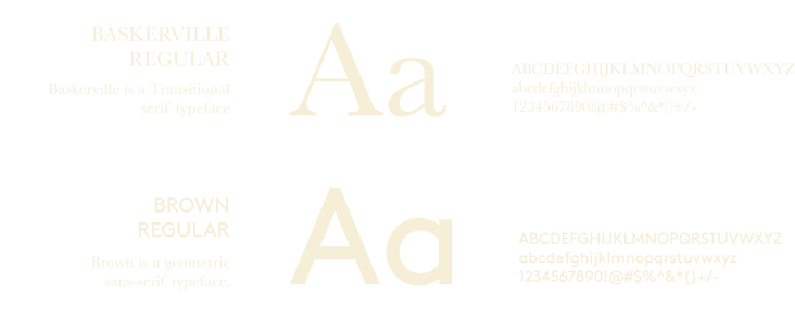
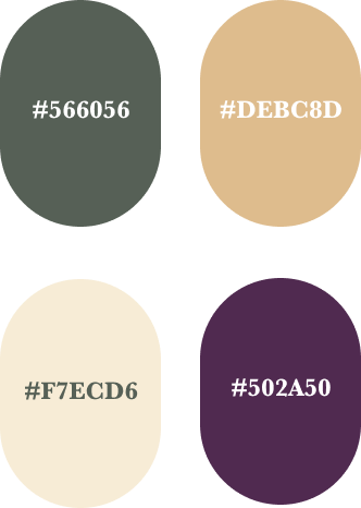
For this brand, we chose a color palette and font that matched well with the logo’s delicacy and simplicity. We went with earthy hues of green, yellow, and beige and used purple as an accent color as its symbolic of their other spa company. The fonts are modern, timeless, and classic.
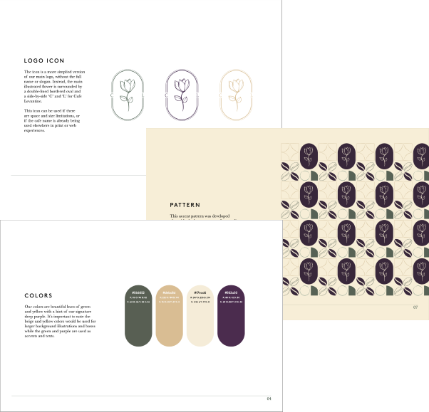
PATTERN AND BRANDING
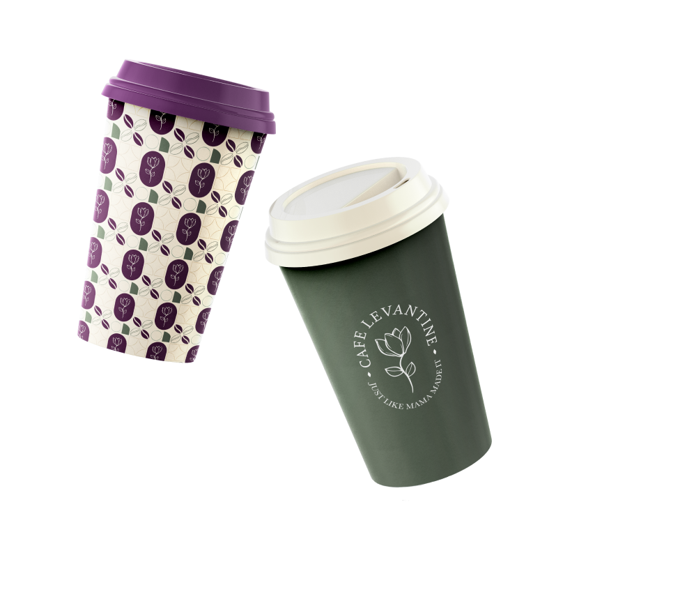
During the logo creation process, our team created this pattern with the logo mark to showcase how the brand can be used in marketing collateral and within the cafe itself. This pattern plays with the coffee bean in an abstract way along with the oval shape of the logo. We also show here how you can use the colors alongside each other.
