MILKIFY BRAND
AND SITE
CLIENT
MILKIFY
YEAR
2022
2023
SERVICES
NEW LOGO
BRAND IDENTITY
WEB DESIGN
YOUR MILK TRANSFORMED
Milkify is a professional freeze-drying service for mothers struggling with breast milk storage, usage, and transportation. They wanted a new brand identity and e-commerce site that aligned with their story.
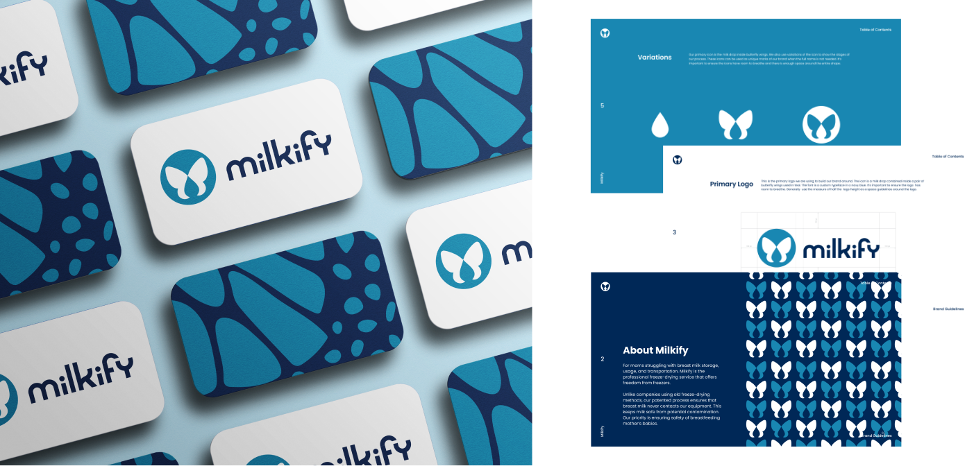
BUTTERFLY WINGS
symbolize transformation from milk to powder
CUSTOM TYPEFACE
creating a unique typeface helped align the brand's values
MILK DROP
retaining elements from old logo in a modern way
BUTTERFLY WINGS
symbolize transformation from milk to powder
MILK DROP
retaining elements from old logo in a modern way
CUSTOM TYPEFACE
creating a unique typeface helped align the brand's values
MILKIFY’S WEBSITE
Milkify’s e-commerce website is meant to help new mothers easily learn about the process of freeze-drying breast milk, nutritional and safety benefits, and to start to place their order. The main goal of this new site from the old was to simplify the checkout process and help mothers to easily adjust their order to their exact needs.
.png)
PATTERNS
This pattern was used on in the packaging design and website. Using abstract shapes to create the markings on a butterfly wing, this pattern solidified the the transformation concept for the brand.


COLORS
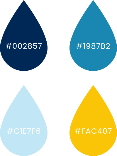
These are the primary colors for the brand, with a variety of blues and an accent of golden yellow. The purpose of the golden yellow color is to classify breast milk as “liquid gold”.
PACKAGING DESIGN
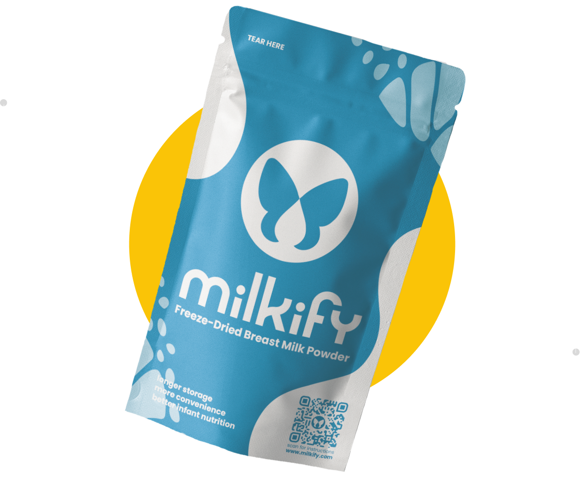
This uniquely designed pouch holds the nutritional value of breast milk after it has been preserved by freeze-drying.
.png)

PATTERN ELEMENTS
The butterfly wing pattern is used in the packaging design and throughout the website to represent the story of transformation.
