PHIN
BRAND AND SITE
CLIENT
PHIN
YEAR
2021
SERVICES
NEW LOGO
BRAND IDENTITY
WEB DESIGN
WEB DEVELOPMENT
The Phishing Challenge
Phin is a security company that educates companies on phishing protection. Their team was looking for a unique ‘under the sea’ theme to compliment their brand. This translated into their logo, brand colors, and eventually website all custom made.
A UNIQUE LOGOMARK
The stingray was a logo we landed on after playing around with a few different sea creatures that would be represent their brand. The stingray symbolizes restraint and awareness which we thought went great with Phin’s overall mission and objective.
UNDER THE SEA
We chose a soft rounded font to pair with this icon
STINGRAY
The Stingray symbolizes maneuverability and calibration
PLAYFUL
We chose a soft rounded font to pair with this icon
A UNIQUE LOGOMARK
The stingray was a logo we landed on after playing around with a few different sea creatures that would be represent their brand. The stingray symbolizes restraint and awareness which we thought went great with Phin’s overall mission and objective.
UNDER THE SEA
We chose a soft rounded font to pair with this icon

STINGRAY
The Stingray symbolizes maneuverability and calibration
PLAYFUL
We chose a soft rounded font to pair with this icon
UNDER THE SEA
We took a unique approach with the website of Phin to stand out from competitors. We liked the idea of carrying the ocean theme to the rest of the site and maintained a light blue backdrop with soft lines and corners. We continued to use the various blue hues from the color palette to emphasize different call out sections, headers and sections.


COLOR PALETTE AND TYPE
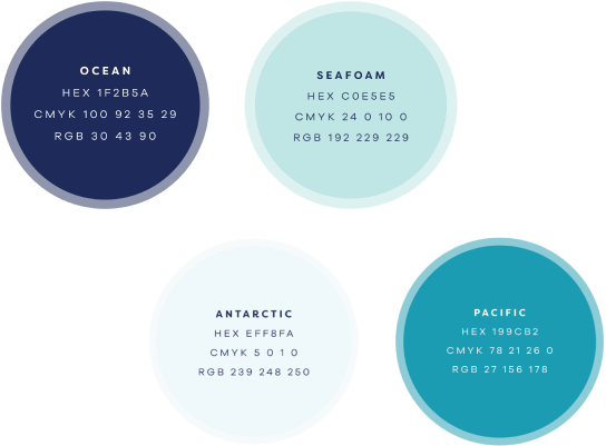
We chose a soft contrasting blue palette for the brand identity that would fit well with the logo, website and other brand material. We went with a soft, sans serif, rounded font to fit the overall theme. This would allow all

FULL BRAND GUIDELINES
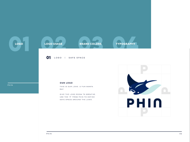
Our comprehensive set of brand guidelines gives indication of when and how to properly use their new logo, the color palette, and fonts. These guidelines help to give a clear idea of how to correctly showcase the brand in any new marketing collateral thats to come in the future.