ROSSEN LANDSCAPE
BRAND IDENTITY
CLIENT
ROSSEN LANDSCAPE
YEAR
2022
SERVICES
NEW LOGO
BRAND IDENTITY
NATURE VS NURTURE
Rossen is a landscaping company that builds and maintains distinctive landscape and garden features for discerning clients. They seek elegant, sleek, and elevated design in all areas, including their logo and brand identity. This is where we came in.
ELEVATED DESIGN
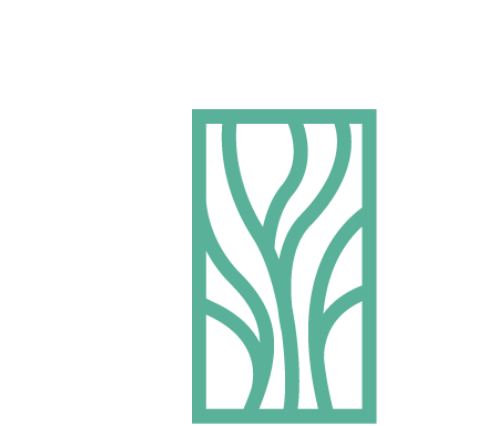
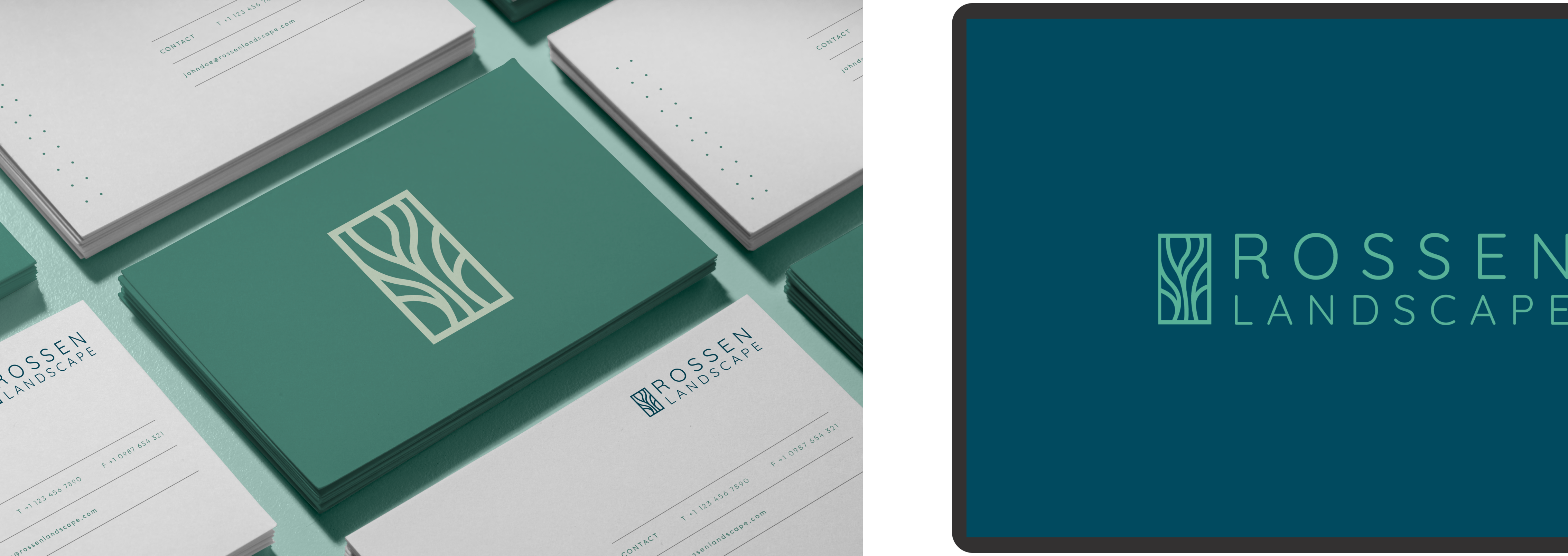
We wanted to create a logo that was sophisticated and elegant for Rossen to best represent their brand. The logo also had to be modern and easily transferrable for all types of collateral to come. We landed on this abstract representation of tree branches enclosed within a box.
Green
The use of a mint green in the main logo was a specific choice to emulate the color of a natural landscape
Tree Formation
The abstract tree formation gives the impression of an elegant and upscale business
Font Usage
The font paired with this icon gives a softer look to the overall brand
ELEVATED DESIGN
We wanted to create a logo that was sophisticated and elegant for Rossen to best represent their brand. The logo also had to be modern and easily transferrable for all types of collateral to come. We landed on this abstract representation of tree branches enclosed within a box.
Green
The use of a mint green in the main logo was a specific choice to emulate the color of a natural landscape
Tree Formation
The abstract tree formation gives the impression of an elegant and upscale business
Font Usage
The font paired with this icon gives a softer look to the overall brand
ELEVATE YOUR LANDSCAPE
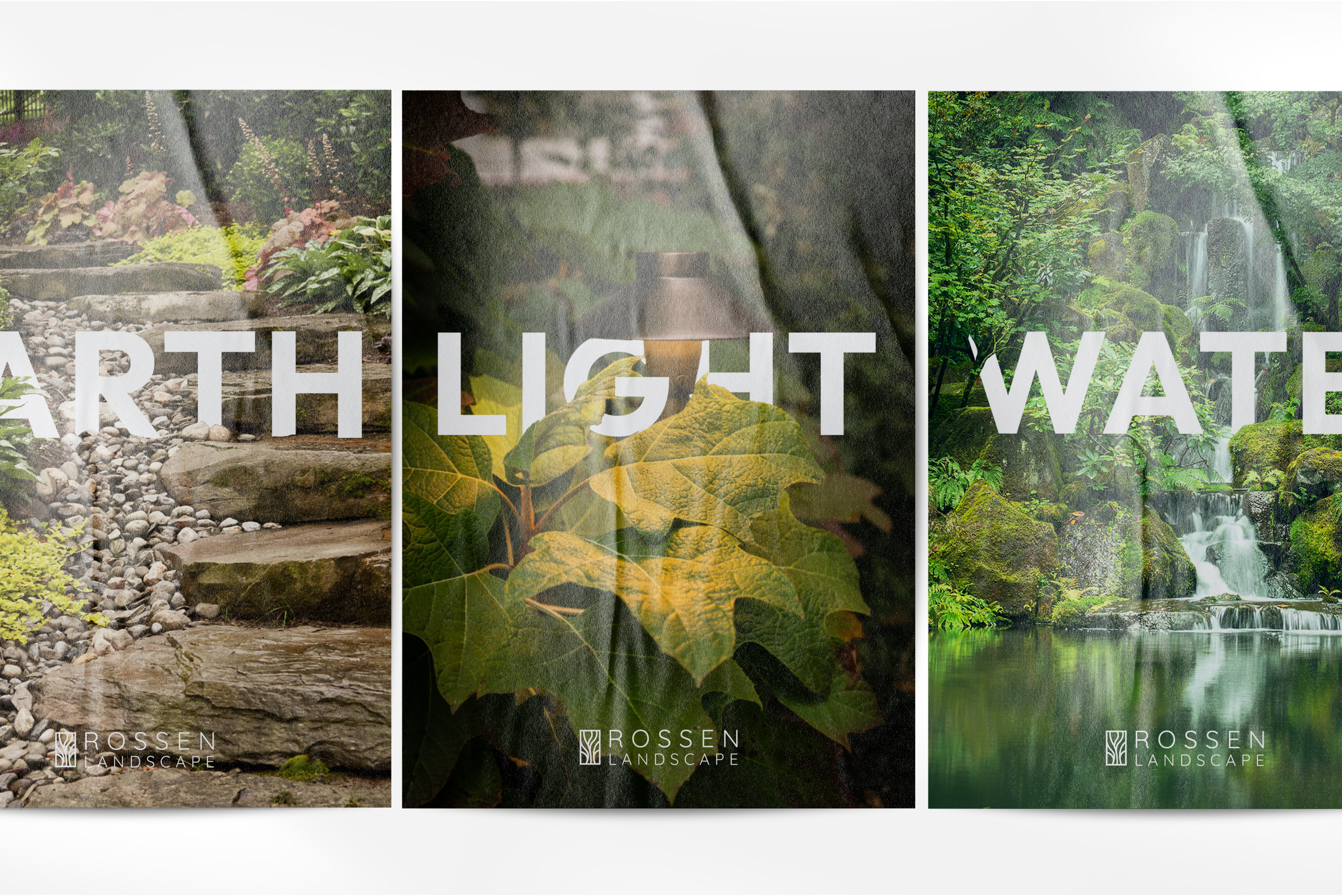
Rossen Landscape focuses on Sticks and Stones, Earth, Light, and Water. We wanted to communicate a few of these elements through the design of the brand. Using the right color palette, new refreshed logo, and fonts, this was achieved.
COLORS AND PATTERNS
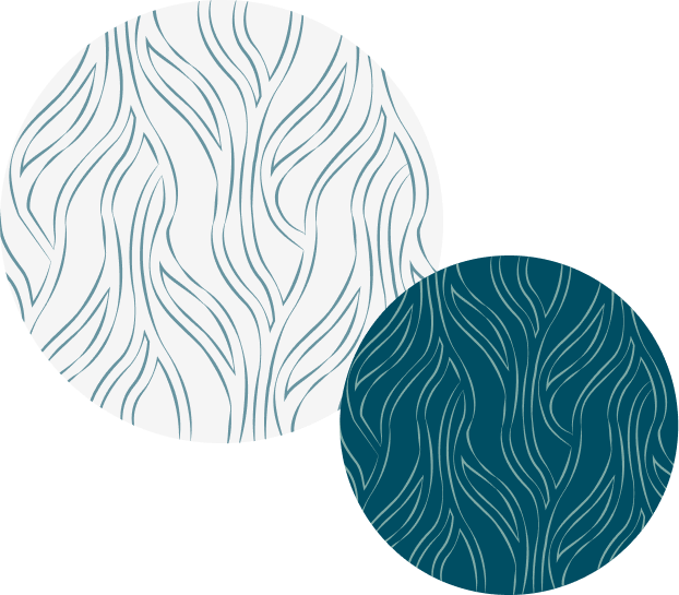
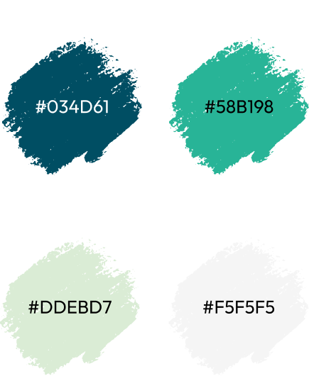
The color palette was inspired by natural colors of blue and green hues, to emulate the purpose of Rossen Landscape and what they do. You can see the colors come to life in the pattern here below. The consistent use of these colors also help to tie the brand together and differentiate Rossen from the rest.
TYPEFACE
A classic sans serif font is used for all Headers and body, while Dream Avenue is used for accents and call out messaging. This mix of fonts helps to keep the brand easily recognizable, and also unique.
